“Wilson Diagram” – interactive pie chart that displays stats simply
In order to get a better idea of the relative sizes of the individual elements that constitute things, it would be great if you could click on each segment of a pie chart so it opened up into a new pie chart – one that, in turn, displayed the relative sizes of its individual elements. You could drill down each time, read a brief summary of it taken from wikipedia and get a better understanding of the world around you.
For example, a Wilson Diagram, or Wilson Chart, for US Government spending in 2017 might look like this…
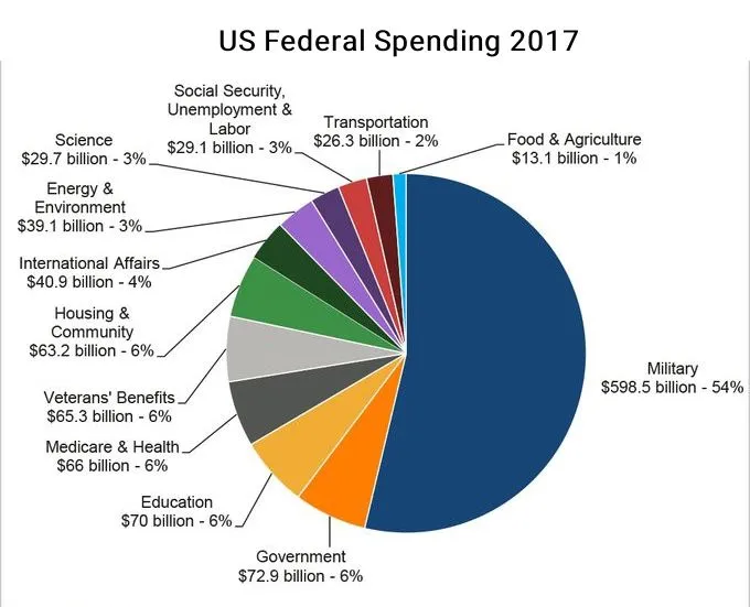
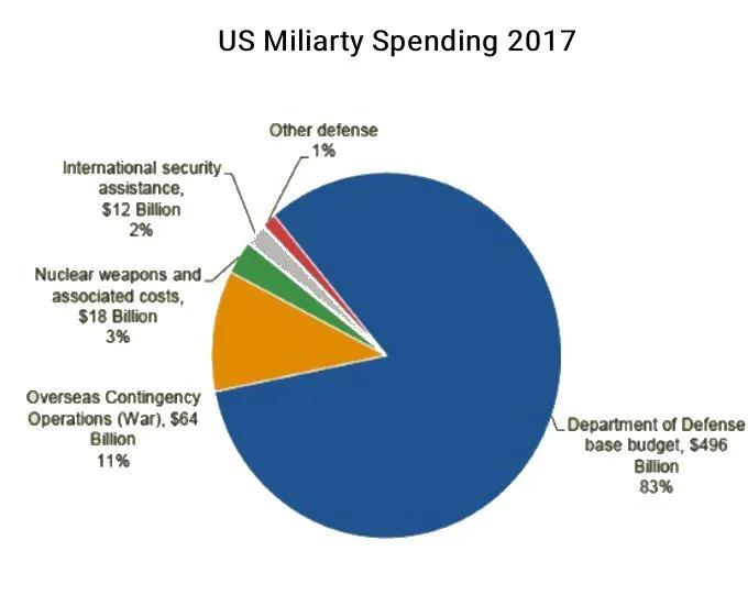
Click on the Military segment and that segment grows into a new chart which further splits the military budget into its constituent parts…
Keep clicking on a segment, to learn about each one and navigate by looking deeper into each subject. Or zoom back out and see the bigger picture. You could even incorporate clickable areas that show the evolution or history of the size of each segment as time goes on, as an animation – watch which segments grow and which get smaller over time, to easily spot trends.
Another example, if you wanted to quickly get an idea of what the Earth is actually made of, you click on a Wilson Diagram for the Earth composition and you would see the biggest segment is labelled Iron. Click the iron segment and it pops out into a new chart displaying the most common forms of iron, and so on down through each element and compound.
Yet another example, the ingredients of food. the composition of the human body, biomass of the earth, the atom, the Universe. Etc.
Note – the numbers in the examples may not be correct – but you get the general picture.


Could be done with html / javascript then uploaded onto a site that lets people create their own charts and connect them together – it sounds like a good way to delve deeper into any subject, I like it, lots of applications, from chemistry and physics to economics and politics.
Infogram should make them so you click a segment of the pie and it takes you to another full pie. That would do the trick.